- DADALI Mahmut (cc241050)
- FURRER Sarah (cc241011)
Team
Project Overview
Dolap is a native Android application that helps users organize their wardrobe, build outfits, track outfit usage, and gain insights into their clothing habits. The app works fully offline using a local SQLite database.
App Development Documentation
App Concept
Goal
Many people own a large number of clothes but struggle to decide what to wear, remember good outfit combinations, or identify unused items. Dolap addresses this problem by connecting wardrobe storage with outfit planning and usage tracking.
Use Case
Dolap is a lifestyle and productivity app that supports personal wardrobe organization and daily outfit planning.
Target Users
- Students and young professionals (18–35)
- People who want to dress well with less effort
- Users interested in making better use of their existing clothes
Core Features
Wardrobe Management
- Create, view, update, and delete clothing items
- Add photos via camera or gallery
- Store attributes such as category, colour, size, season, and tags
Outfit Builder
- Create outfits with name, occasion, season, notes, and rating
- Add and remove clothing items from outfits
- View and edit outfit details
Outfit History
- Log dates when an outfit was worn
- Quick action to mark an outfit as worn today
- View wear history grouped by date
Tags and Smart Filters
- Pre-defined tags such as “Basic”, “Casual”, or “Cozy”
- Multi-select filters for Clothing Item Search
Insights
- Overview of outfit wears
- Most worn outfits
- Never worn clothes
- Least worn clothes
- Clothes not worn in the last 90 days
Hi-Fi Prototype & User Flow
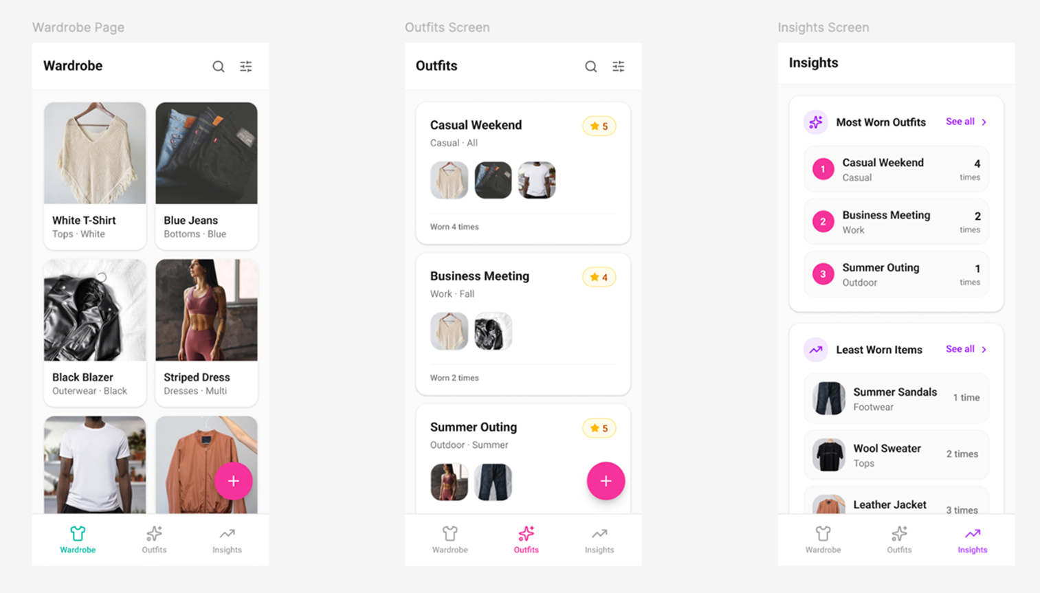
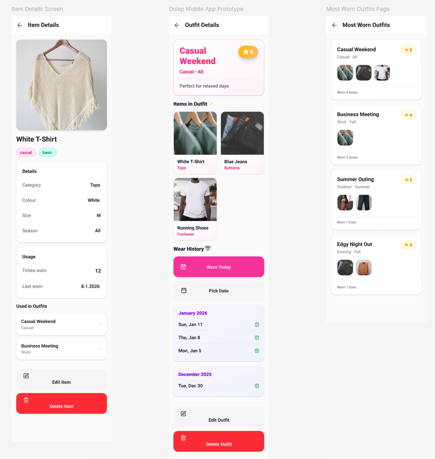
A high-fidelity prototype was designed in Figma to visualize the final application. The main navigation is divided into three sections: Wardrobe (Clothes), Outfits, and Insights.
- Add a clothing item from the Wardrobe screen
- Create an outfit by selecting items from the wardrobe
- Log when an outfit is worn
- Explore Insights to understand wardrobe usage
Technical Implementation
- Kotlin + Jetpack Compose
- MVVM architecture
- Room (SQLite) local database
- Offline-first design
Entity Relationship Diagram of Database
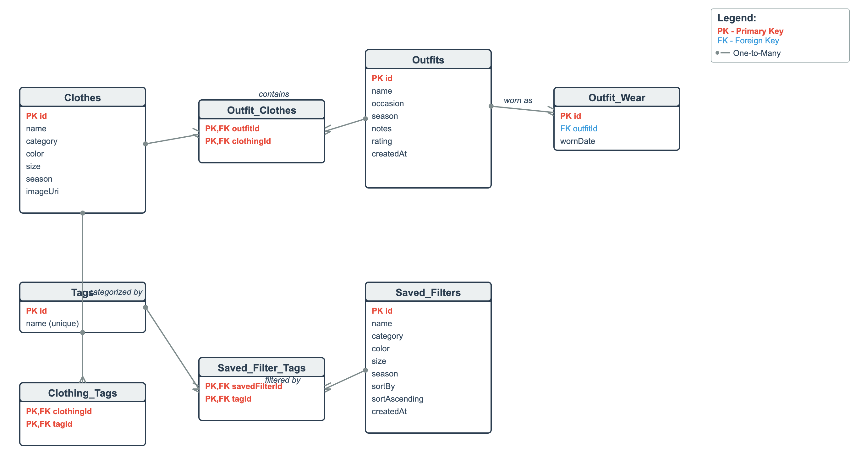
The Entity Relationship Diagram (ERD) represents the structure of the SQLite database used in our Dolap application. The database consists of core entities including Clothes, Outfits, Tags, and Saved_Filters, each identified by a primary key. Many-to-many relationships are implemented using junction tables, such as Outfit_Clothes for linking outfits and clothing items, Clothing_Tags for categorizing clothes with tags, and Saved_Filter_Tags for associating saved filters with tags. A one-to-many relationship exists between Outfits and Outfit_Wear, which stores outfit wear history. This design reduces redundancy and supports efficient data organization.
Usability Testing
We conducted a usability test with six participants and evaluated core user tasks such as adding clothing items, creating outfits, logging wear history, and using filters and insights.
Self-reflection DADALI Mahmut
In this project, I worked together with my colleague on the design, development, and evaluation of the mobile application Dolap as part of the course Creative Code Lab 3. Before the course started, we collaboratively developed the app concept and created a high-fidelity Figma prototype, which we presented on the first day of CCL3. During this phase, we defined the goal of the app, its core features, and the target user group, which provided a clear foundation for the further development process.
During the implementation phase, we used my previous mobile coding course project as a starting point. While this initial version only supported basic clothing management and filtering, we significantly expanded the app together throughout the semester. My main coding contributions included implementing the outfit builder with clothing selection and image previews, establishing the many-to-many relationship between outfits and clothing items, adding outfit wear history with date management, and developing the Insights screen with wear-based analytics. In addition, I worked on improving UI and UX consistency across the app, including image handling, layout structure, navigation, and visual clarity.
Alongside the development process, my colleague and I prepared and conducted the usability study. We jointly created all required documentation, including the moderator script, informed consent form, participant background questionnaire, task sheets for moderators and participants, SEQ and SUS questionnaires, UEQ-S, observer notes, and the post-test interview guide. We also developed a usability test plan, conducted a heuristic evaluation based on Nielsen’s heuristics, formulated hypotheses, and defined the data to be collected. In total, we conducted six usability tests, during which I acted as the active interviewer in three sessions.
After the testing phase, I was mainly responsible for evaluating and analysing the collected data. This included processing questionnaire results, summarizing findings, and creating graphs for the usability documentation. Through this project, I learned how important it is to combine technical implementation with continuous user evaluation. I gained deeper insights into Android development, database design, and Jetpack Compose, while also strengthening my skills in usability testing and data analysis. Overall, the project helped me better understand the complete lifecycle of an app, from early concept development to testing and refinement, and highlighted the importance of collaboration and iterative improvement.
Self-reflection FURRER Sarah
For this project, I worked together with my teammate on the mobile app Dolap as part of the Creative Code Lab. The app was based on my teammate’s existing mobile coding course project, which already included basic clothing management features. During Creative Code Lab, we continued working on this foundation and focused on extending the functionality, improving usability, and refining the overall design based on user and expert feedback.
My main role in the project was implementing new features and translating design and usability feedback into concrete changes in the app. Early on, I worked on improving the clothing flow by adding a splash screen, predefined tags, size options, camera and gallery support, and more consistent delete actions. I also implemented a complete tagging system for clothing items, including tag storage, tag selection in add and edit screens, visual tag chips, and SQL-based filtering in the search. This made browsing and filtering clothes much more practical and user-friendly.
Another major part of my contribution was building the outfits feature. I implemented the outfits tab with full create, edit, and delete functionality, added the necessary repositories and ViewModels, and integrated the new screens into the existing navigation without breaking the original wardrobe flow. This allowed users to group clothing items into outfits and laid the foundation for outfit-based insights.
We planned and conducted the usability tests together. While my teammate mainly focused on analysing and evaluating the collected data, I was responsible for implementing the feedback from both the usability tests and the professor. Based on this feedback, I revised several screens by adjusting font sizes, improving spacing and padding, increasing touch target sizes, and refining button hierarchy, for example by making edit actions more prominent than delete actions. I also worked on improving overall visual consistency and clarity across the app.
In the Outfits and Insights sections, I implemented additional design improvements to make information easier to scan and understand. This included adding icons and thumbnails, reworking how ratings are displayed, limiting and structuring lists such as “most worn” items, and making key actions easier to access. Overall, this short but intensive project helped me learn how to iteratively improve an existing app by directly translating user and expert feedback into UI and code changes. It strengthened my skills in Jetpack Compose, UI/UX implementation, and working with a larger, pre-existing codebase under time pressure.
Usability Test Plan
App Overview
Dolap is a mobile wardrobe app that allows users to:
- Add clothing items with photos and tags
- Create and manage outfits
- Track wear history
- View insights about clothing usage
Target Users for the Study
- 6–8 participants, ideally
- Students and young professionals (18–35)
- People who want to dress well with less effort
- Users interested in making better use of their existing clothes
Heuristic Evaluation (Nielsen’s)
| Heuristic | Observations | Severity |
|---|---|---|
| Visibility of system status | The app usually gives clear feedback (e.g. snack bars for delete/undo, wear counts updating). Some actions, like saving edits, could give clearer confirmation feedback. | Minor |
| Match between system & real world | Concepts like Outfits, Tags, and Wear history match how people think about their wardrobe. The wording is simple and easy to understand. | Minor |
| User control & freedom | Users can undo deletions, giving them control over mistakes. Removing delete actions from grid items reduced the risk of accidental actions. | Minor |
| Consistency & standards | Material 3 components are used consistently across screens. Image handling and button placement were recently unified, which improves consistency. | Minor |
| Error prevention | Important fields (e.g. name, photo) are validated. Removing delete actions from quick taps helps prevent accidental errors. | Minor |
| Recognition rather than recall | Images, thumbnails, chips, and previews help users recognize items instead of remembering details. | None |
| Aesthetic & minimalist design | The app is colourful but still structured. Some screens were simplified to reduce clutter and make content easier to scan. | Minor |
| Help users recognize, diagnose & recover from errors | Error messages exist, but some could be clearer (e.g. explaining why a form cannot be saved). | Minor |
| Flexibility & efficiency | Search for clothes and outfits helps experienced users work faster. | Minor |
| Help & documentation | There is no built-in help or onboarding yet, but the app is simple enough to understand on your own. | Minor |
Sarah and Mahmut each did their own heuristic evaluation, then discussed each other’s points and made this final version. Overall, the heuristic evaluation indicates that Dolap is easy to use and well structured. It uses familiar concepts, consistent layouts, and clear visuals that help users understand and navigate the app. Most actions give good feedback and error prevention is handled well, though some confirmations and error messages could be clearer. Only minor usability issues were found.
Testable Questions, Hypotheses and Variables
TQ1: Core Task Completion
Testable Question: Can users successfully complete the core tasks of the Dolap app (adding, editing, deleting clothing items and creating outfits)?
Hypothesis (H1): Most participants will be able to complete the core tasks successfully without critical errors.
Variables
- DV:
- Task completion rate (%)
- Time on task (in seconds)
- Error rate (number of errors per task)
- SEQ score per task
TQ2: Workflow Clarity
Testable Question: Do users understand the workflow and required steps for completing tasks in the Dolap app?
Hypothesis (H2): Participants will understand the required steps for completing tasks and follow the intended workflow without major confusion.
Variables
- DV:
- Task completion rate (%)
- Observation notes
- SEQ score per task
TQ3: Search Function Effectiveness
Testable Question: Can users effectively find clothing items and outfits using the search functionality?
Hypothesis (H3): Participants will be able to find specific clothing items and outfits using the search function within a reasonable time and with few errors.
Variables
- DV:
- Task completion rate (%)
- Time on task (in seconds)
- Error rate
- SEQ score for search tasks
TQ4: Understanding of Insights
Testable Question: Do users understand the information presented on the Insights screen?
Hypothesis (H4): Participants will be able to correctly interpret the insights provided by the app.
Variables
- DV:
- Accuracy of interpretation
- Correct interpretation of data on Insights Screen
- Verbal explanation during post-task interview
- SEQ score for Insights task
TQ5: Overall Usability Satisfaction
Testable Question: How do users perceive the overall usability of the Dolap app?
Hypothesis (H5): The Dolap app will achieve a System Usability Scale (SUS) score above the acceptable threshold and positive user experience ratings, particularly for hedonic quality.
Variables
- DV:
- SUS score
- UEQ-S scores:
- Pragmatic Quality
- Hedonic Quality
- Qualitative feedback from post-test interview
Methods for Data Collection
Setup
- Lab-based (moderated usability test)
- 6–8 participants
- Environment: Quiet room with a laptop and an Android phone provided by us
- Audio recording for think-aloud protocol
Quantitative Methods
Task Performance Metrics
- Time on task (in seconds)
- Task completion rate (%)
- Error rate (number of errors per task)
Standardized Questionnaires
- SEQ after each task
- SUS at the end of each test
- UEQ-S before the Post-Test Interview
SEQ and SUS help us understand how easy the tasks and the app are to use, while UEQ-S helps us understand how users feel about the app overall, such as whether it is enjoyable, attractive, and pleasant to use.
Qualitative Methods
- Think-aloud protocol
- Observation notes (hesitation, confusion, unexpected behaviour)
- Semi-structured Post-Test Interview (likes/dislikes, perceived problems, improvement suggestions, …)
Planned Tasks
- Add a new clothing item with photo, category, and tags
- Search for your created item by filtering for it
- Edit an existing clothing item (change the colour, season and tag)
- Delete an existing clothing item
- Create a new outfit and add clothes to it
- Find the outfit using the search function and open it
- Mark the outfit as “worn today”
- View insights and interpret the data available (most worn clothes, never worn clothes, least worn clothes, not worn in 90 days)
Documents and Tools
Documents
- Script for Moderators (what we say to the participant at the beginning of the study, general information, etc.)
- Informed Consent
- Participant Background Questionnaire (to evaluate age, gender, etc.)
-
Task Sheet for Moderators
- Tasks/scenarios, time needed, Success (yes/no), Help needed (yes/no) and Additional Notes
- Task Sheet for participants
- Post-task: Single Ease Question (SEQ)
- Post-study: System Usability Scale (SUS) Questionnaire
- Post-Test Interview
- User Experience Questionnaire (Short) with 8 items
- Observer Notes
Tools
- Android phone
- Laptop with Emulator and Microsoft Forms open (Informed Consent + Digital Questionnaires)
Usability Test Documentation
Usability Test Results
This section presents the results of the usability test conducted to evaluate the system’s usability and overall user experience. The analysis includes participant demographics, task performance, task-level usability (SEQ), overall usability (SUS), user experience quality (UEQ-S) and qualitative feedback.
Participant Demographics
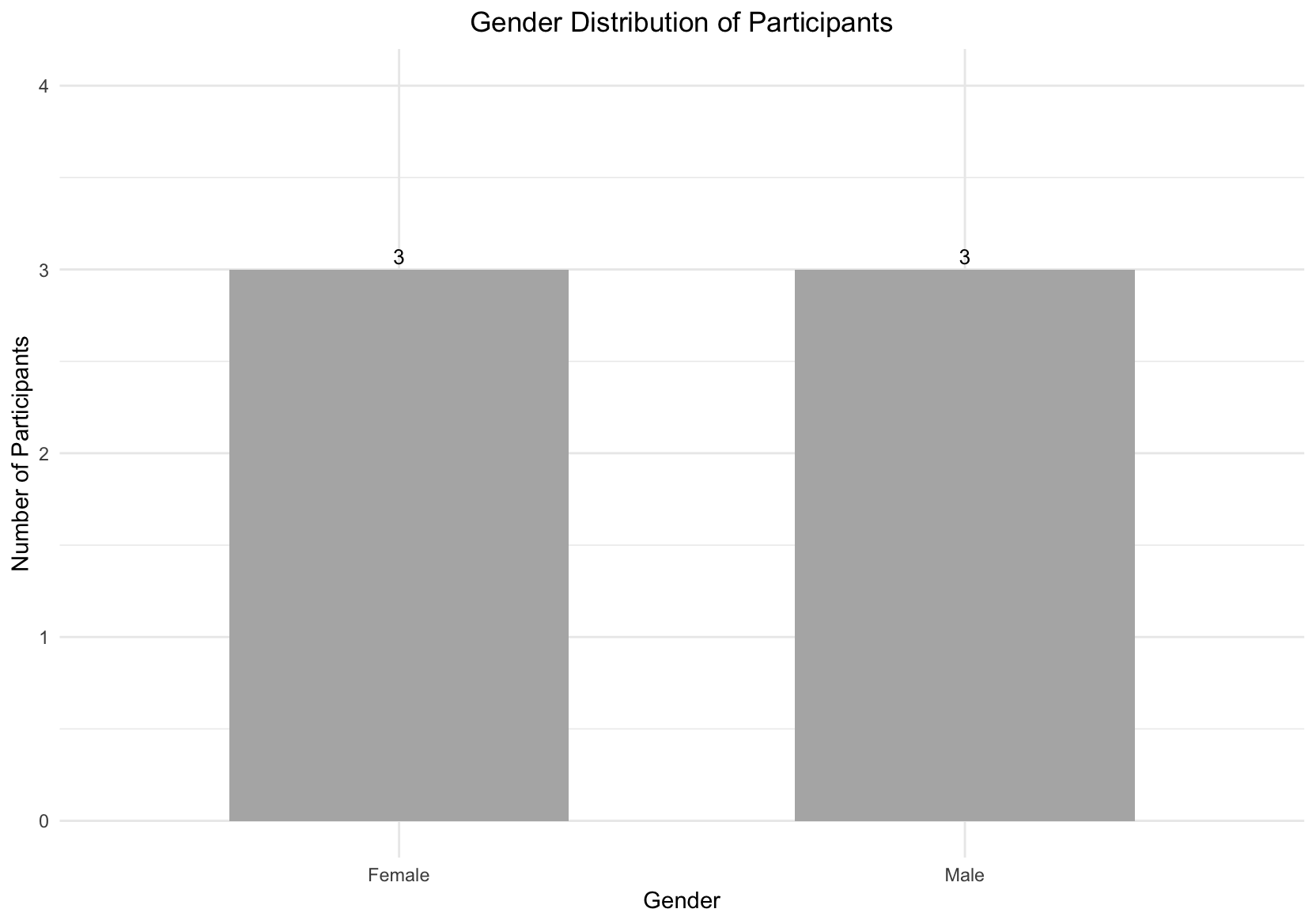
The usability test was conducted with six participants. Participants had a mean age of 26 years, with ages ranging from 20 to 36, representing a user group aligned with the app’s intended target audience.
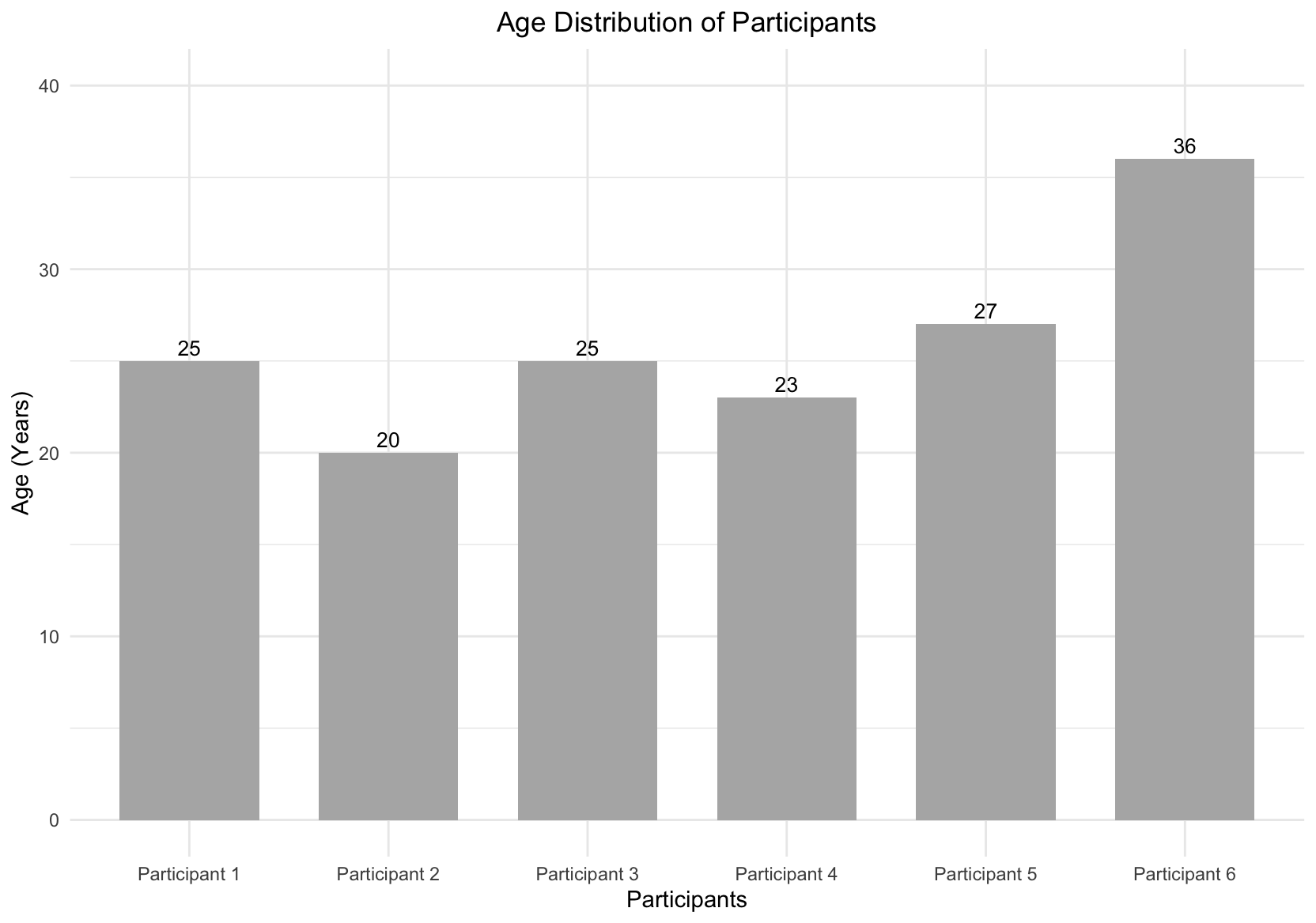
Gender distribution was evenly balanced, with three male and three female participants (50% / 50%), ensuring that results were not biased
toward a single gender group.
Task Completion
All participants successfully completed all eight tasks, resulting in a 100% task completion rate. No task failures or critical usability breakdowns were observed during the test. This indicates that users were able to understand task goals and navigate the interface effectively without external assistance.
Task-Level Usability (Single Ease Question SEQ)
Task-level usability was measured using the Single Ease Question (SEQ) after each task. Mean SEQ scores across the eight tasks ranged from 6.50 to 7.00, demonstrating consistently high perceived ease of use. No task scored below 6.5, suggesting that none of the evaluated tasks caused notable difficulty for users.
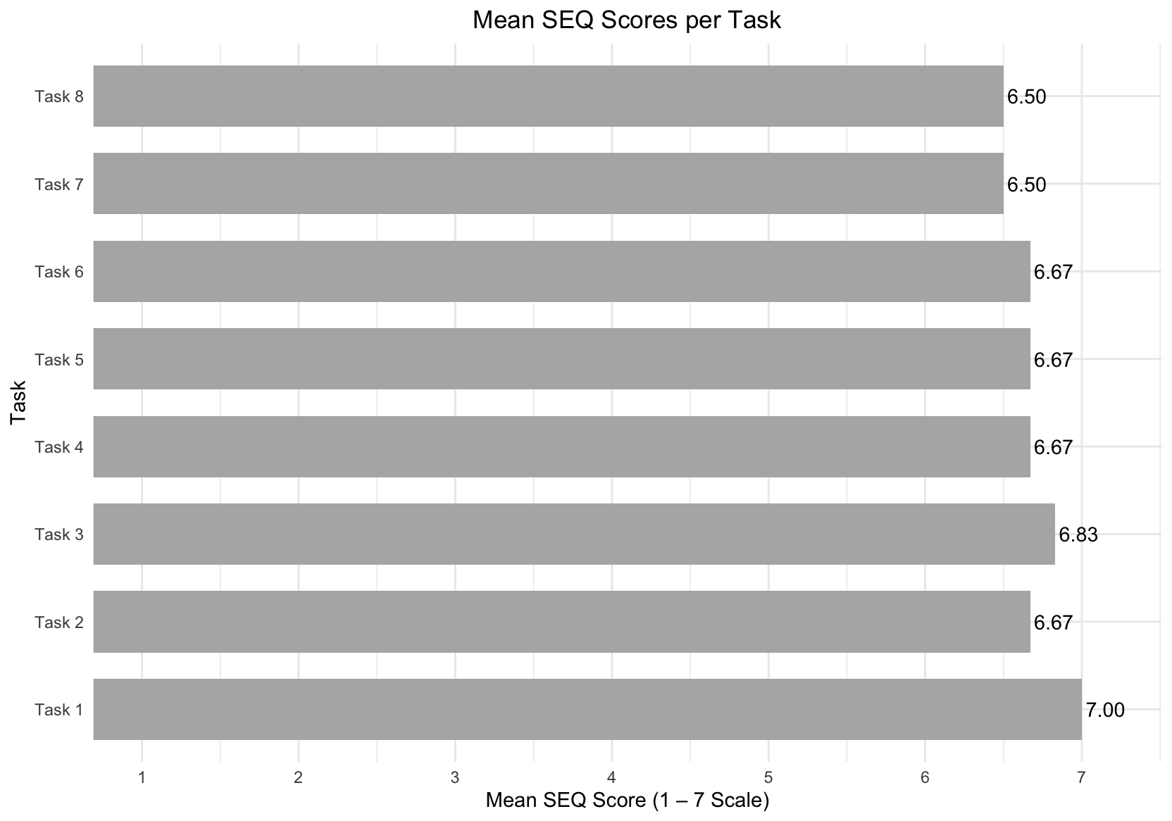
The overall mean SEQ score was 6.69, which indicates that participants found the tasks very easy to complete overall. These results suggest that the interaction flows, labels, and system feedback successfully supported task execution and that users rarely needed to pause, reconsider, or recover from errors.
Overall Usability (System Usability Scale SUS)
Overall system usability was assessed using the System Usability Scale (SUS). Individual SUS scores ranged from 85.0 to 100.0, with an overall mean SUS score of 96.3.
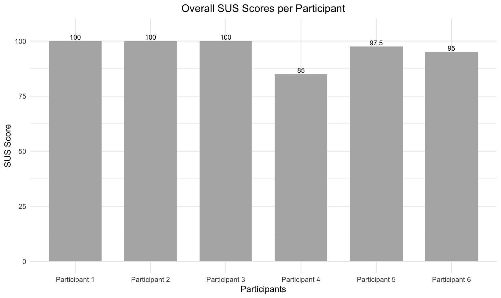
According to established SUS interpretation guidelines, this score falls well within the excellent usability range. The consistently high scores indicate that participants perceived the system as intuitive, efficient, and easy to learn, with very low overall usability friction.
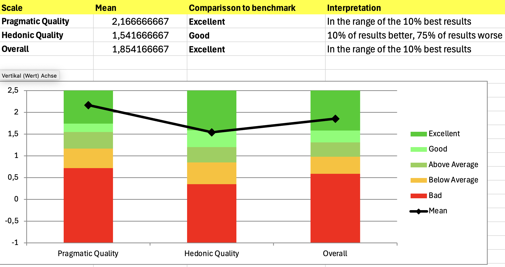
User Experience Evaluation (UEQ-S)
User experience was evaluated using the UEQ-S benchmark, which measures both pragmatic and hedonic aspects of user experience.
- Pragmatic Quality achieved a mean score of 2.17, rated as Excellent, placing the system among the top 10% of benchmarked products. This reflects strong perceptions of efficiency, clarity, and usefulness.
- Hedonic Quality achieved a mean score of 1.54, rated as Good, with 75% of benchmark results scoring lower. This indicates a positive emotional experience, though slightly less pronounced than the pragmatic aspects.
- The overall UEQ-S score was 1.85, rated as Excellent, again placing the system within the top 10% of benchmark results.
Qualitative Feedback
Qualitative feedback was collected through post-test questions to complement the quantitative results and provide deeper insight into user perceptions and experiences.
Overall, participants consistently described the app as easy or very easy to use, reporting little to no difficulty during interaction. Several participants noted that navigation felt intuitive once they became familiar with the interface, supporting the high SEQ and SUS scores observed across participants.
Participants reported a positive overall experience, frequently describing the app as intuitive, smooth, and enjoyable. The app’s usefulness for outfit planning was mentioned multiple times, particularly the ability to track when outfits were last worn, which was seen as highly relevant to users’ everyday needs.
Most participants reported no confusion or frustration while completing tasks. When issues were mentioned, they were localized rather than systemic. Recurring problems included difficulty noticing the “worn today” feature, limited search functionality for outfits compared to clothing items, and minor expectation mismatches after deleting items. These issues were described as minor and did not significantly affect the overall experience.
Most tasks were perceived as easy due to the app’s clear layout and straightforward interface. Adding and editing items were frequently mentioned as the easiest tasks, while searching for outfits and locating the “worn today” functionality was perceived as less intuitive, pointing primarily to discoverability issues.
Participants generally reported that they knew what to do next while completing tasks. Occasional moments of confusion were brief and easily resolved, indicating effective system feedback and recoverability.
Suggested improvements focused mainly on enhancing the visibility and feedback of the “worn today” feature, adding shortcuts for frequent actions, improving outfit search, and refining edit and delete interactions. Notably, some participants indicated that they would not change anything, reinforcing the overall positive perception of the app.
Expert Feedback and Design Iterations (Most Relevant Feedback)
In addition to user testing, the app design was reviewed by our Mobile User Interface (MUID) lecturer based on a screen recording of the application. He provided expert feedback focusing on visual hierarchy, spacing, touch target sizes, and interaction clarity. All suggested improvements were incorporated into the design.
Key refinements included increasing font sizes for secondary text, adjusting paddings to improve visual balance, and ensuring consistent border radiuses across buttons. Touch accessibility was improved by enlarging tap areas for tags and frequently used controls, in line with mobile usability guidelines.
Form interactions were refined by using full-width input fields and dropdowns and by strengthening the visual emphasis of primary actions such as the “Save” button. Edit and delete actions were visually rebalanced to prioritize non-destructive actions and reduce accidental errors.
Navigation and information presentation were improved through clearer visual cues, consistent use of icons, and alternative visual representations for ratings, occasions, and seasons. Thumbnails were added to the Insights screen to improve scannability.
Additionally, one usability test participant was our User Experience Evaluation (UEE) lecturer, who also provided oral feedback during the test session. This feedback was also incorporated, including limiting the number of “most worn outfits” displayed, setting the outfit overview as the landing page, and replacing text-based edit and delete buttons with icons for greater consistency.
Summary of Findings
Across all evaluated measures, the system demonstrated very high usability and user experience quality. The combination of a 100% task completion rate, high task-level usability (SEQ), an excellent overall usability score (SUS), excellent UEQ-S benchmark results, and consistently positive qualitative feedback shows that users were able to complete tasks easily, efficiently, and with a high level of satisfaction. These findings are further strengthened by expert feedback from UI and UX lecturers, which was fully incorporated into the design through targeted refinements. While the small sample size limits generalizability, the convergence of user data and expert review provides strong evidence of a well-designed, user-centered system.